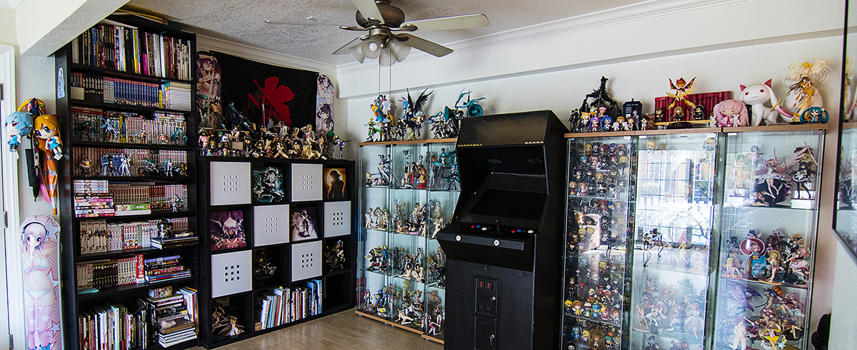

It's been not only a long time since I've posted here, but it has been a long time since I shared photos of my place. The last time you guys saw where I lived I was still living at home with my parents. It was back in 2012, so easily 4 years ago you saw my collection. Now you can see not only has my… [more]


So since I've moved into my new apartment I still hadn't set up my photography studio. Seems work has me busier than I thought I would ever be, however I took some time this past weekend to set up my studio so I could take some photos of my latest purchase, Alter's 1/8th Melty from Shining Hearts. Now… [more]
![[Alter] – Melty Review](https://howagirlfigures.com/wp-content/uploads/2014/01/IMG_9095.jpg)
![[Alter] - Melty Review](https://howagirlfigures.com/wp-content/uploads/2014/01/IMG_9095.jpg)
Pre-ordered this figure the moment she was released for pre-order. I needed for for multiple reasons, she's sexy/half naked, plus while she's not Sora she reminds me of Sora from Yosuga no Sora! But she's Yuki from Maid Yome and she's pretty amazing. The only issue is her adorable mouth really looks… [more]
![[Orchid Seed] – Yuki Review NSFW](http://farm3.staticflickr.com/2821/11004311995_a056263bc7_o.jpg)
![[Orchid Seed] - Yuki Review NSFW](http://farm3.staticflickr.com/2821/11004311995_a056263bc7_o.jpg)
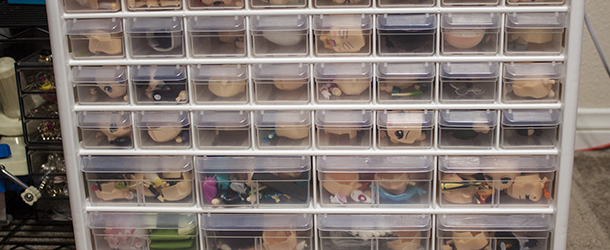
I recently went on a trip to a magical place, The Container Store. Ok it's not really magical, but I happen to have discovered a love for organizing my home. I tend to prefer Ikea and Daiso but we went to The Container Store on a whim and I discovered this lovely storage container! I've been needing… [more]


I’ve wanted to do a complete redesign of my site for a while. I’ll be the first to tell you I loved the original design of my site. I loved the festive bright colors and it very much reflected my own personal taste. Yet lately I’ve been feeling the need to change it up a little, go for a more professional look instead of a childish playful look. Yet at the same time I wanted to keep my overall taste and my touch within the site design. There are still a few kinks I need to work out and while it looks good on my own monitor, I know right now some posts won’t look right if you’ve got a small monitor, but bare with me for a bit while I go through and resize some of the images on my older posts. But what do you guys think overall? Do you like this new design? Miss the old one instead? Are you glad the old one is gone? Do you just not care? Do you love it so much you’ll come back every day to just look at the lovely design? Do you hate it so much you’re never coming back? Too many questions? ^^ But if you notice anything majorly wrong with the site that you think i might not have noticed let me know and i’ll fix it up!
You can now follow me on Twitter!
[ad#hagf-ad-1]
It looks good, more organized, new theme and stuff. Choice of colors though is a little weird but that may just be me. Good work. Themes and blogs always take a long time to do, eh? Every time I mess with mine it takes a few hours or more. :\
Panthers last blog post..Classic Females Are Expensive
I liked the old design better.
I like the new design (Now using 3 columns!!). And I think the page loads faster.
phossils last blog post..Desktop wallpaper
Site redesigning is fukken SERIOUS business.
Kairu Ishimarus last blog post..Eclipse First Impressions: I never knew I would go this far
Looks pretty good to me. I just think the nav bar up top (with the About/Contact, Desktop, etc links) should have a background color, because the first few are a little hard to see with the mascot art right under it. But yeah, otherwise, I like it. 😀
Oh… maybe you could reposition it too, so it’s on the left side instead. That way you wouldn’t have a stripe covering up the mascot art.
I was more fond of the more playful style of your blog before. But I’ll probably become accustomed to this as well.
Lovelyduckies last blog post..First Semester is DEAD! Long Live Video Games!
Ahhh I liked the older one. It had more of a blog feel. This one seems a bit not as personal.. I donno xD
@Panther:
yeah this took me all last night
@double:
yeah? what did you like about the old design the most? maybe i’ll try and integrate it with this new one?
@phossil:
i think it loads faster too!
@Kairu Ishimaru:
it is when you loose sleep over it :'(
@Ana:
ahhh, see that depends on the size of your monitor, i’ve got a huge one so Hanako is more over to the middle and not the right, maybe i’ll try and fix that too
@Lovelyduckie:
maybe i can make this one feel more playful?
@Ayu:
ok i need to go for more personal i guess, i wanted to go for personal/professional. But it’s hard to do both… 🙁
imho your old design didn’t look too personal – I mean, it was a bit more ‘playful’, but it still was clean and organized. I don’t really like the new one, because it feels too plain and simple for my taste..
waaarghs last blog post..[Eye Up] 1/8 Yoko
Ahh, I didn’t know it was a variable width layout. I’m using an older computer so the highest resolution I get is 1024×768. XD;
@waaargh:
maybe i just to make thsi one more playful then? I’ve got a few ideas i can incorporate
@Ana:
yeah, check it again, i lowered the height of the Page Titles so it shouldn’t cover up Hanako anymore
It looks good. I’m sure the more you work with it the better it will become. Just keep gnawing at it until it takes a good shape.
It’s much too busy for my tastes, but I do at least like the color scheme. 🙂
0rions last blog post..Happy 1 Year Anniversary Epic Win!
The new layout is nice though I did like the old one better. ^^
The only thing that really bothers me with the new layout is the sidebars. It seems like there is a huge chunk of them now but before I never really noticed them. I don’t know why. =x
Spirit Rubis last blog post..Miku Hatsune 1/8 Scale (GSC) – Get!
I love the new layout! Naturally, the last one was amazing too, but I can see what you were going for in this one and the more “professional but fun” look shines through well.
losttys last blog post..Clannad -After Story- episodes 7+8
@DQ: No Giga Drill Breakers? LOL, as long as it doesn’t remind me of Panther’s, I’m happy. ^_^
xJAYMANxs last blog post..Blog 178 > Blog Antics & Anime Battles
This one’s nice. I think there should be a different color like bar where the about links are (like the bar on the post’s title, maybe in the blue of the stuff to the right). I didn’t really notice them until I really looked. It would help them to stand out more. :3
Lareins last blog post..Quick Yuki figma Photo shoot
This one looks nice, the previous one was good too. This ahas the more ‘professional’ taste in my opinion..^^
nice work.^^
onimans last blog post..Sequel to Nodame Cantabile: Paris Scheduled for Fall 2009
You site looks a lot neater and more organized I say!!!
It’s really nice…
I was wonder what was this when I came to your site last night…thought you were testing a new theme…
The picture seems fine…nothing wrong with it…
I do like the color of the site…
I would like to suggest to put your mascot on the side left or right of the side…looks a lot better in my mind…either way…still good!!!!!
Rins last blog post..Haruhi-ism!!!
@Dj Tama:
I’ve been chewing on it all day and i think I’ve got it down now
@orion:
yay on color scheme
@Spirit Rubi:
see that’s why i like the new side bares, make you notice their content as well
@lostty:
well thanks, good people can see what i was going for
@xJANMANx:
you don’t like panthers?
@Larein:
see i think the red is a nice contrast to the blue there and makes it a bit easier to read
@oniman:
awesome thanks, i was going for professional!
@Rin:
see she’s in the middle since if you have a smaller monitor she’d be pushed to the side and be blocking much of the top. so in the middle she doesn’t get covered by anything
@DQ: Well, while I don’t mind his content, Panther’s is the only otaku blog I’ve seen which still reminds me of the 1990’s look-and-feel. Not my preference, but maybe it’s intentional. (Sorry, Panther, had to be honest, lol. ^^;)
xJAYMANxs last blog post..Blog 178 > Blog Antics & Anime Battles
Great job on your site redesign. I see you added more features. Going with the three column helps w/ oranization. You kept your original charm so kudos on the upgrade!!! ^_^
yukionnas last blog post..For my anime boy lovers